Qing calligraphers show strength with powerful strokes
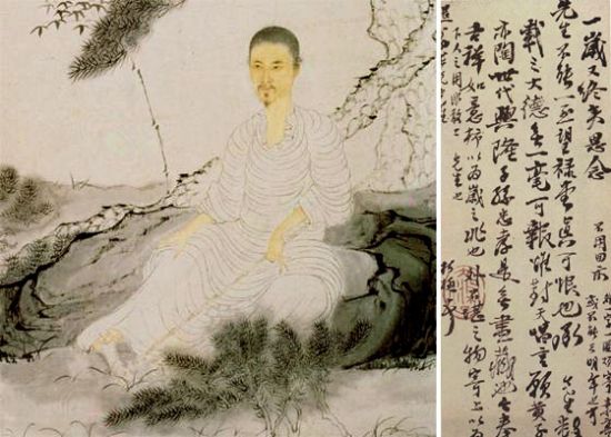
Shi Tao (1630-1724, a Qing painter and calligrapher) and his work of tie
The calligraphy of the Qing Dynasty was characterized by an emphasis on the beauty of strength. This artistic admiration for strength embodied a dissatisfaction found in society at large over the Qing court’s weakness and desire for the growth of a powerful nation.
Scholars divide Chinese calligraphy of the Qing Dynasty into two broad categories: one was bei, or stone inscriptions, and the other included copies of authentic works of calligraphy known as tie.
Works of tie in the Qing Dynasty utilized longitudinal strokes between characters to shift space naturally with rhythm and explore the beauty of a flowing writing style.
Calligraphers in this style molded the final shape of the characters and manipulated the space between them by utilizing a multitude of techniques, such as applying varying degrees of pressure, using hollow strokes, accelerating and decelerating the motions of the brush as well as creating distinct contrast among the size of characters, the length of rows, the shape of dots and the thickness of lines.
Chinese calligrapher and politician Liu Yong (1719- 1804) developed a new way of mixing different styles within a single work so that there was no fixed position for each character on the paper. The size and style of characters as well as the vigor of strokes were decided by the whims of the artist in a distinctive free-form method.
The inscriptions of the bei style forsook the traditional cursive script in favor of a method that used the inclination between characters to reveal their elegance. The bei stressed the overall picture of characters in order to realize an integration of the length of strokes, the structure of characters, the rhythm of wielding the pen, the density of ink and other elements.
The delicate application of ink activated the natural energy of simplicity using only black and white. The calligraphy of Zheng Fu (1622-1693) represented the integration of bei, and his works produced abundant changes of characters in sparse and intensive forms.
Yang Minggang is from the Department of Chinese Language and Literature at East China Normal University.
The Chinese version appeared in Chinese Social Sciences Today, No. 615, July 2, 2014
Translated by Zhang Mengying